
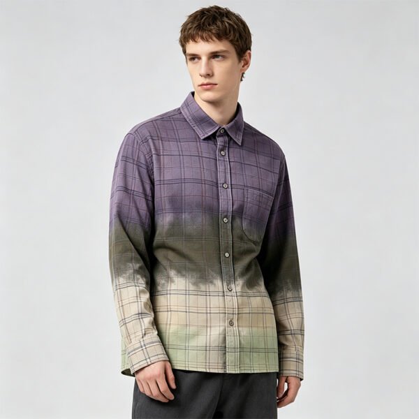

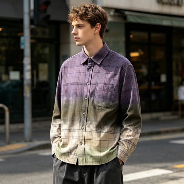
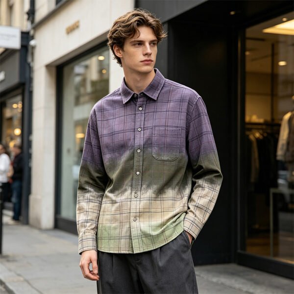
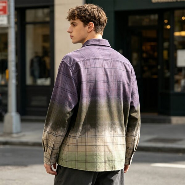
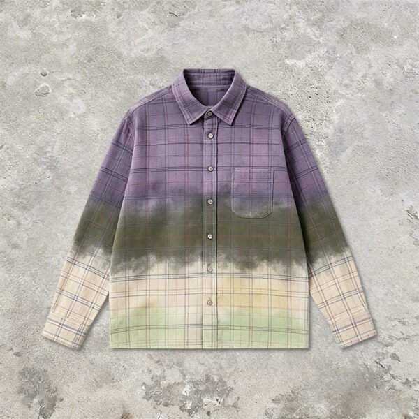
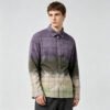
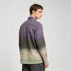


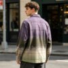
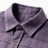
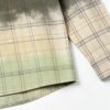
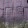
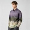
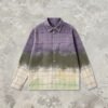
This custom gradient plaid long-sleeve shirt is a color-control project with a visible construction framework. The purple-to-olive-to-cream transition must remain legible without overpowering the plaid, while the pocket, collar, and placket provide fixed checkpoints for evaluating repeatability under agreed lighting.
The Gradient Is a Controlled Color Field
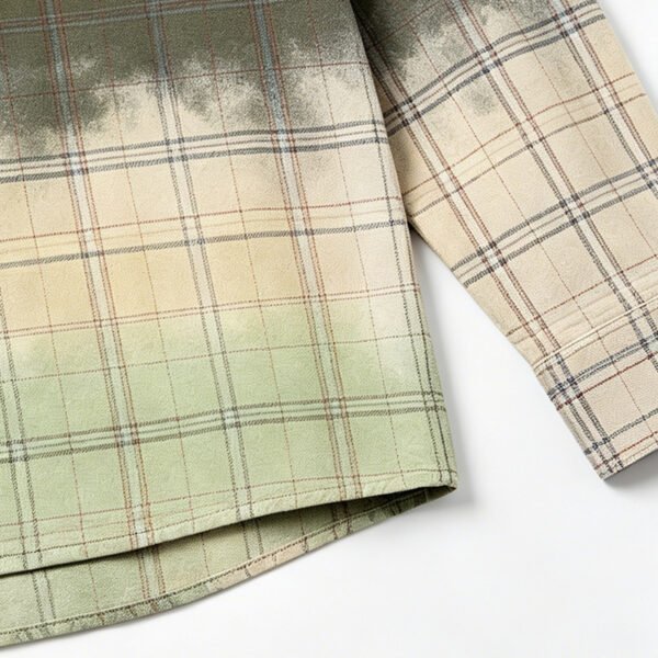
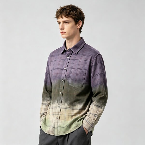
The supplied image shows a clear vertical transition from muted purple near the shoulders through olive at the midsection into pale cream near the hem. Because the shift is gradual, small changes in spray density or dye uptake can alter where each color appears.
Define the gradient with physical or digital color references at fixed body landmarks, such as collar, chest, waist, and hem. The development record should describe acceptable transition zones, because a vague instruction can produce garments that share colors but not the same visual rhythm.
Why Lighting Changes the Approval Result
Purple, olive, and cream can change apparent saturation and contrast when viewed under different light sources. A gradient that looks balanced in a cool studio may appear warmer, darker, or more uneven in retail lighting, especially where the plaid lines cross transitional zones.
Set one primary evaluation light and one secondary comparison light before color approval. Review the front body, sleeves, pocket, collar, and placket in both conditions, documenting whether the transition remains intentional rather than allowing lighting differences to become production disputes.
Keeping Plaid Legible Through the Fade
The plaid remains visible across the image, giving the shirt structure beneath the sprayed color. If the application becomes too heavy, the checks may disappear; if it is too light, the gradient may lack depth. The correct balance preserves both pattern identity and color movement.
Use the plaid repeat as a fixed visual reference during sampling. Examine several horizontal and vertical points across the body and sleeves, then confirm that color intensity does not erase the intended lines or create abrupt blocks around seams and construction breaks.
Pocket and Placket as Color References
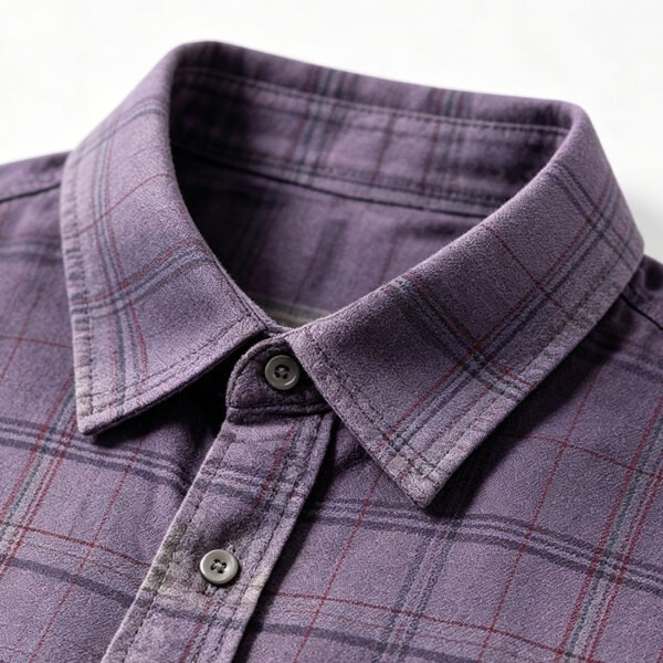
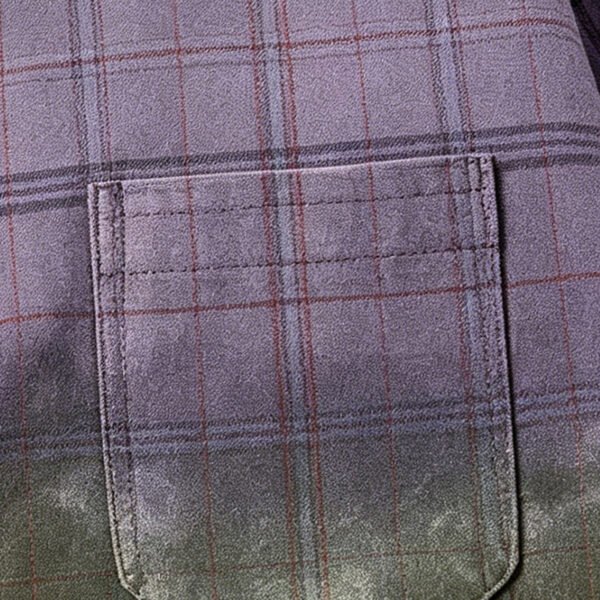
The single chest pocket interrupts the plaid field and therefore becomes a sensitive area for checking both color continuity and pattern alignment. The button placket and turn-down collar also create straight, stable lines that reveal uneven spraying or inconsistent color registration.
Specify whether the pocket should match the surrounding plaid, align its checks, or intentionally read as a separate panel. Compare pocket, placket, and collar samples under the same light so construction decisions support the gradient rather than masking its inconsistencies.
VeeWen Development Checkpoint
Within VeeWen's product-development workflow, this shirt should move from color mapping to a sewn sample before final appearance approval. The color map should identify landmark zones, while the sample confirms how spraying, plaid layout, pocket placement, and seam construction interact on the actual block.
The buyer review should include labeled images or swatches made under the agreed lighting conditions. VeeWen can then use the approved reference to evaluate subsequent samples consistently, separating acceptable handmade variation from changes that affect the commercial color standard.
Trade-Offs and Final Approval
A stronger spray effect can create more dramatic separation between color zones, but it may reduce plaid clarity and increase panel variation. A softer transition protects pattern visibility, yet it can appear less distinctive or lose definition under bright, cool lighting.
Approve the style when the gradient hierarchy, plaid readability, pocket treatment, collar, and placket remain coherent in the selected lights. Record the accepted color references and tolerance notes before releasing the style at MOQ: 100 pieces per style.
Buyer Questions
Is the gradient color already production approved?
No. The image establishes the visual direction only. VeeWen should create a controlled color reference and approve the gradient under specified lighting before production release.
Why inspect the shirt under multiple lights?
Different light sources can change perceived warmth, saturation, and contrast. Reviewing consistent primary and secondary lights helps prevent a balanced sample from appearing commercially inconsistent later.
How should the chest pocket be handled?
Confirm whether the pocket matches the surrounding plaid and gradient or acts as a deliberate panel. Review its alignment, color continuity, and placement under the approved lighting conditions.
What is the minimum order quantity?
The commercial minimum is MOQ: 100 pieces per style. Production remains dependent on approved color references, fabric, pattern, pocket treatment, and construction specifications.
Approve the Lighting-Controlled Color Standard
Share the target palette, lighting environment, size range, and plaid reference so VeeWen can develop a measurable gradient sample for buyer approval.



Reviews
There are no reviews yet.