






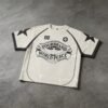





This jersey should be approved as a graphic system, not simply as a decorated polyester top. The large central artwork, fine internal marks, contrast piping, and patch detail must remain crisp while the printed surface stays wearable and balanced.
Edge Clarity Controls Graphic Authority
The front graphic carries substantial visual weight, combining bold lettering, illustrated forms, thin internal lines, and small marks. On a pale jersey, clean boundaries are essential because any spreading or broken detail can make the artwork appear muddy at retail viewing distance.
The correct checkpoint is fabric-specific registration and edge review, including the smallest lettering and narrow contours. Approve the artwork on the selected knit, because substrate stretch, surface texture, and ink absorption can change apparent sharpness after curing and handling.
Ink Film Should Not Overpower the Jersey
Large printed coverage can create a noticeable film, especially across the center chest where the image shows extensive artwork. Too much deposit may feel heavy, stiff, or plasticky, while too little can reduce opacity and weaken the pale-to-dark contrast that gives the jersey its identity.
Development should balance opacity with flexibility through artwork separation, deposit control, and curing review. The buyer should assess the print by touch and movement, confirming that the graphic remains readable without becoming the dominant tactile element of the garment.
Contrast Piping Frames the Print
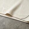
Black piping traces the shoulder and body lines, creating a structured frame around the central decoration. This construction detail sharpens the jersey outline but also introduces alignment points that can expose inconsistencies if the print, seams, and panels are developed independently.
Placement approvals should include the relationship between piping, sleeve inserts, neckline, and artwork boundaries. A small shift can make the front look unbalanced even when the print itself is accurate. Review the complete assembled garment rather than isolated decoration panels.
Mixed Decoration Needs a Unified Surface Standard
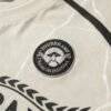
The source wording identifies DTG print and an embroidered patch, while the image shows a small chest badge-like element alongside the large central graphic. Mixed techniques create useful hierarchy, but their thickness, edge definition, and reflectivity must feel intentional when viewed together.
A raised patch can add focal contrast against a flatter print, yet excessive stiffness may interfere with drape or comfort. Confirm attachment security, patch scale, embroidery density, and print hand feel as one coordinated standard before approving the final decoration package.
Fine Details Require Size-Aware Testing
The design includes a visible number mark, small circular insignia, narrow lettering, and detailed illustration. These elements may reproduce differently from the dominant central artwork, so one successful large print does not prove that every detail will remain commercially clear.
Prepare size-aware artwork checks for the smallest marks and review them under normal showroom distance and close inspection. The approval decision should specify minimum readable detail, acceptable edge softness, and any elements requiring simplification for stable reproduction.
VeeWen Workflow Connects Artwork to Wearability
VeeWen can organize this development through artwork separation, fabric strike-off review, assembled jersey sampling, and hand-feel assessment. Each stage should answer a product-specific question: whether graphic boundaries, piping alignment, patch relief, and surface flexibility work together.
The buyer's approval record should capture print density, edge tolerance, patch dimensions, placement, curing expectations, and final measurements. VeeWen's OEM, ODM, private-label, and cut-and-sew workflow can then translate that graphic standard into production-ready instructions.
Buyer Questions
Why does ink-film hand feel matter here?
The central artwork covers a substantial front area. Excessive film can feel stiff and heavy, while insufficient deposit may reduce opacity, edge definition, and perceived graphic quality.
How should fine artwork be approved?
Review the smallest lettering, narrow contours, numbers, and badge details on the selected jersey fabric. Confirm clarity after curing and handling, not only from a digital artwork preview.
Can printing and patches be developed together?
They should be coordinated together because thickness, scale, placement, and contrast affect visual hierarchy and comfort. Approve the assembled garment to judge their combined surface balance.
What is the commercial minimum?
The exact commercial minimum is MOQ: 100 pieces per style. Final quantities, specifications, and production details should follow the approved development record and quotation.
Approve the Graphic Surface Standard
Share the artwork, jersey references, patch details, and target fit with VeeWen. We can structure sampling around readable edges, controlled ink hand, aligned piping, and wearable decoration.


Reviews
There are no reviews yet.