
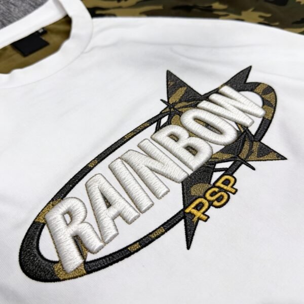
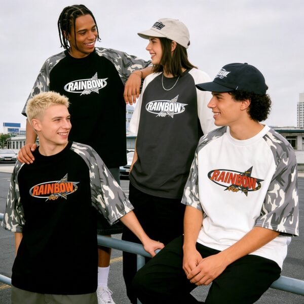



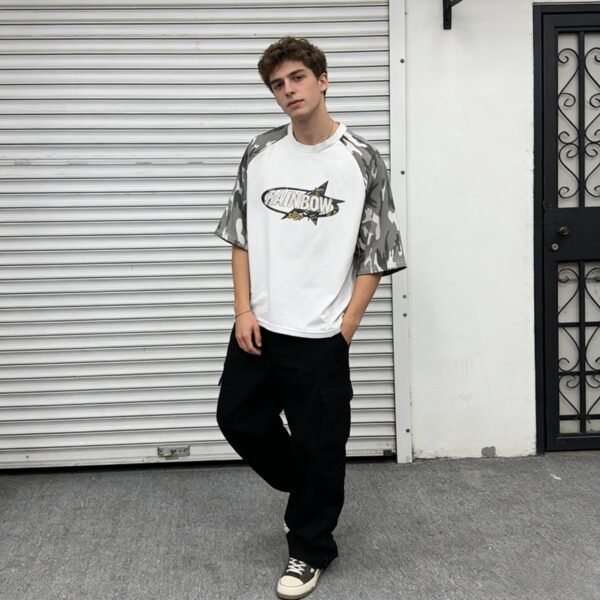
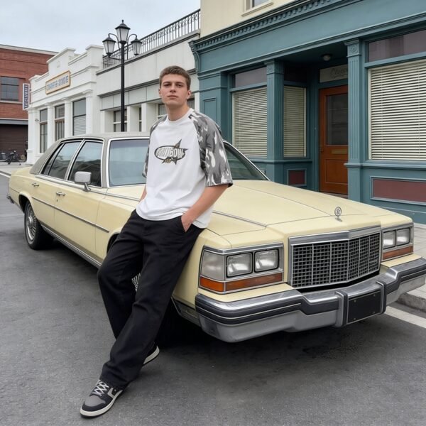
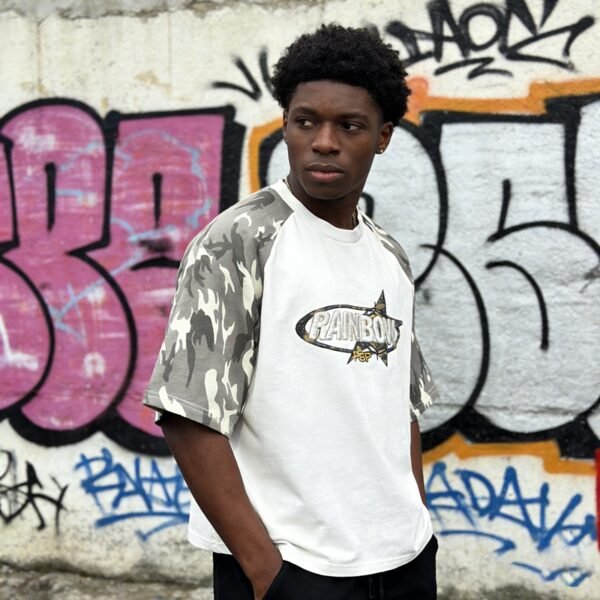

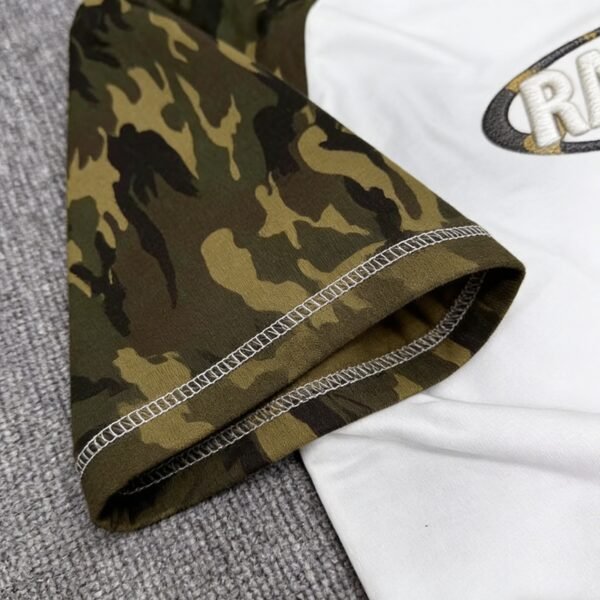
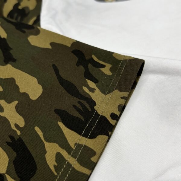








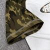

This custom raglan T-shirt is built around the tension between dimensional embroidery and engineered imperfection. The close-up shows raised lettering, a camouflage-inspired frame, and dense outlines on a light jersey ground. Its success depends on placing distress and relief where seams do not distort either feature.
Relief Is the Primary Visual Mechanism
The supplied image makes the embroidered lettering visibly sit above the fabric, with rounded thread columns catching light differently from the jersey ground. That relief creates a premium tactile cue, but it also adds thickness, stitch density, and a defined perimeter that must be managed.
The surrounding black border and camouflage-inspired shapes increase visual complexity around the raised letters. Their function is not merely decorative; they frame the relief and establish contrast. The final artwork should identify which areas are filled embroidery, flat embroidery, applique, or printed support.
Distress Must Remain Intentional
Distress can add age, irregularity, or visual tension, but uncontrolled placement near seams may look like construction failure. Raglan joins change fabric direction, while patchwork panels introduce additional seam allowances and local thickness. Distress marks should therefore be positioned as designed interruptions, not random damage.
The strongest treatment may be concentrated on stable open areas of the body or sleeves, leaving a deliberate buffer near structural joins. This preserves seam integrity and makes the distressed effect easier to repeat across production units, especially when the graphic crosses multiple visual fields.
Seam Clearance Protects the Graphic
The source title identifies raglan and patchwork sleeve details, while the image shows a dense emblem requiring controlled placement. If heavy embroidery lands too close to a seam, the joining operation can compress stitches, shift the design, or make the relief sit unevenly across the panel boundary.
A technical artwork file should include seam maps and no-go zones before digitizing. Clearance should account for seam allowance, needle access, pressing, and post-sew distortion. This protects both the raised lettering and the surrounding outlines from appearing crowded or mechanically displaced.
Thread Density and Hand Feel
Three-dimensional embroidery depends on a built-up foundation and a controlled top layer. Too little density may flatten the intended relief, while excessive density can stiffen the shirt and create puckering around the motif. The white thread shown against white fabric makes contour quality especially important.
Buyers should approve the hand feel alongside the appearance. A bold raised logo may support a statement product, but a softer profile can improve comfort and drape. The decision should reflect where the motif sits, how much area it occupies, and the expected styling use.
VeeWen Development Checkpoint
VeeWen's workflow should begin with a construction-aware artwork review, linking the embroidery file to the raglan and patchwork pattern pieces. Distress zones, seam buffers, stitch directions, backing choices, and panel color references should be documented before a sample is judged.
At sample review, compare the relief across panel joins and inspect whether distress reads consistently after sewing. The buyer should approve the digitized profile only when the graphic remains centered, the seams lie flat, and the irregular details look deliberate rather than accidental.
Bulk Release and Commercial Control
For this style, MOQ: 100 pieces per style applies to the complete approved specification. Because embroidery, panel assembly, and distress each introduce variation, the approval record should define acceptable differences in thread coverage, camouflage placement, and distressed edges.
Before production release, confirm the cotton-blend composition, garment weight, sleeve panels, embroidery relief, distress map, and care communication. The buyer's final checkpoint is a signed visual standard that protects the concept while acknowledging the natural variation of dimensional textile work.
Buyer Questions
Why is seam clearance important for this T-shirt?
Raglan and patchwork seams alter fabric direction and thickness. Keeping relief and distress clear of those joins helps prevent distortion, puckering, crowded edges, and inconsistent graphic alignment.
How should the 3D embroidery be approved?
Approve both relief height and hand feel through a physical sample. Review thread coverage, backing, stitch direction, comfort, and appearance where the motif approaches panel or seam transitions.
Can distress be added without weakening the garment?
Yes, when distress is mapped onto stable open areas and buffered from structural seams. Its scale, edge character, and repeatability should be documented before bulk production.
What material details need confirmation?
The source identifies a cotton blend, but not percentages, GSM, or knit structure. VeeWen should confirm those details with the buyer before costing and production approval.
Map the Graphic Before Sampling
Share the artwork, preferred distress character, target embroidery relief, and panel direction. VeeWen can translate them into a seam-aware development brief for MOQ: 100 pieces per style and approval.


Reviews
There are no reviews yet.