



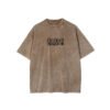




This development record treats the T-shirt as a coordination problem between garment treatment and graphic readability. The supplied image shows an earthy washed base, darker seam definition, and concentrated rear artwork, creating a clear approval sequence for sampling, placement, and production control.
Treatment Sets the Visual Baseline
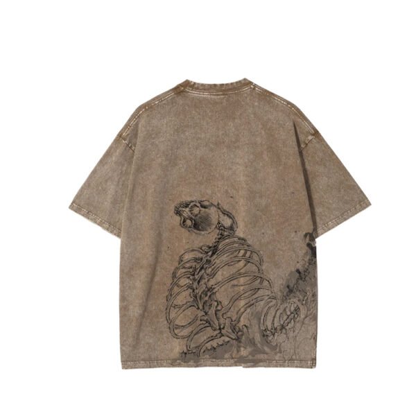
The image presents a deliberately uneven brown tone rather than a flat dyed field. That variation changes the perceived value of every later detail, so the wash must be treated as a primary design component, not a finishing step added after artwork decisions.
Because the rear panel carries the strongest visual information, development should define acceptable light and dark zones before approving bulk. A controlled reference panel can establish whether the surface remains sufficiently legible while preserving the worn, dimensional appearance shown in the supplied image.
Graphic Contrast Requires Surface Testing
The dark skeletal illustration is readable because it sits against a relatively light central ground, while surrounding wash variation adds atmosphere. If treatment becomes too dark beneath the artwork, line separation may weaken even when the print file remains unchanged.
Sampling should therefore compare artwork clarity across the highest and lowest tonal areas, including the lower hem and side transition. The approval question is practical: does the graphic retain its intended line hierarchy after washing, rather than merely matching a digital artwork preview?
Seams Reveal Process Behavior
The shoulder, sleeve, side, and hem seams appear more defined than adjacent fabric in the supplied image. This suggests that construction density or exposure may influence treatment uptake, making seam behavior an important part of the finished visual rather than incidental background detail.
VeeWen development should inspect seam ridges, neckline binding, and hem turns after the proposed treatment sequence. Any contrast increase can support the rugged aesthetic, but excessive edge darkening may make the garment appear unevenly assembled or distract from the back graphic.
Artwork Placement Balances Impact and Wear
The illustration begins well below the neckline and expands toward the lower back, leaving breathing room around the collar and upper shoulders. This placement gives the design a strong rear focal point while allowing the washed shoulder structure to remain visible.
The buyer should confirm the graphic bounding box against graded sizes before approval. A fixed placement that works on one sample may drift visually on larger or smaller bodies, especially when the artwork approaches the side seam and lower hem.
VeeWen Workflow for Treatment Approval
VeeWen can structure development around a wash reference, artwork placement map, and side-by-side approval sample. The key handoff is a combined visual standard showing the treated base and graphic together, so neither department approves an isolated component.
For the MOQ: 100 pieces per style run, the buyer should record acceptable tonal range, graphic position, and seam contrast in the approved sample notes. Those checkpoints give cutting, printing, and finishing teams one shared interpretation of the intended result.
Trade-Offs and Final Checkpoint
A stronger wash can make the T-shirt feel more distinctive, but it also increases tonal variation and may reduce consistency across panels. A lighter treatment improves graphic predictability, yet can soften the worn character visible in the supplied image.
Before production release, approve one physical sample after the intended treatment and graphic sequence. Check rear readability, seam contrast, size grading, handfeel, and wash tolerance, then decide whether visual character or repeatability needs greater priority.
Buyer Questions
Is the brown color confirmed for production?
The supplied image shows an earthy brown washed appearance. Final shade, wash tolerance, and color standard remain To Confirm through an approved physical development sample.
Where is the main graphic positioned?
The visible artwork is concentrated across the lower back and extends toward one side. Final dimensions, placement tolerances, and graded positioning require buyer approval.
Does the source confirm silk-screen printing?
The source wording references silk-screen printing, while the image confirms a dark applied graphic. Ink system, coverage, curing, and wash durability remain To Confirm.
What is the minimum commercial quantity?
The exact commercial minimum is MOQ: 100 pieces per style. Final quantities, size ratios, colorways, and packaging requirements should be confirmed during quotation.
Approve the Wash and Artwork Standard
Send VeeWen the target artwork, preferred wash direction, size range, and delivery brief. We can align the physical treatment reference and graphic placement before your MOQ: 100 pieces per style decision.


Reviews
There are no reviews yet.