


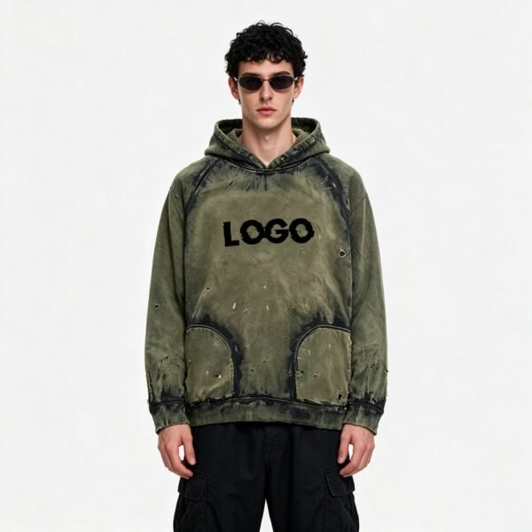




This hoodie should be developed as a placement-control problem. Its army green base is interrupted by tonal spray, holes, pocket seams, and ribbing, so the approved visual must remain intentional when artwork, distress, and garment dimensions change between sizes.
Placement Must Follow Garment Landmarks
The close-up shows darker spray concentration crossing the body while pocket seams divide the surface into recognizable zones. Those landmarks should anchor the artwork map, because a fixed distance from a pattern edge will shift visually when the garment is resized.
VeeWen should convert the approved appearance into landmark-based instructions for body, pocket, hem, and side areas. The buyer can then judge placement against seams rather than relying on an unscaled image that may not reproduce consistently across sizes.
Distress Scale Changes with Size
Small holes and torn marks are visible at different distances from one another, creating an irregular surface rather than a single repeated graphic. If the same absolute marks are used on every size, larger garments may appear under-detailed while smaller ones become crowded.
The development sample should test whether distress count, spacing, and mark scale need controlled adjustment by size. VeeWen's approval record can distinguish fixed signature marks from variable supporting marks, preserving character without promising identical randomness.
Pocket Boundaries Protect Legibility
The image clearly shows two pocket sections with rounded upper edges and dark seam definition. These boundaries interrupt the spray field, so excessive shading or distress near the openings could obscure construction and make the front look visually congested.
The placement review should reserve a readable zone around pocket edges, hem ribbing, and major seams. That restraint gives the distressed treatment room to show variation while maintaining the garment's functional architecture and making the front panel easier to evaluate in product photography.
Tonal Contrast Needs a Repeatable Target
The army green surface includes darker, cloudy tonal variation rather than a uniform color field. Such variation can make a hoodie feel developed and worn-in, but uncontrolled contrast may cause one size or batch to look substantially different from the approved reference.
VeeWen should define the acceptable tonal range through signed visual standards, identifying base color, darker spray intensity, and areas where contrast must remain restrained. The buyer's checkpoint is a side-by-side review under consistent lighting before bulk approval.
Ribbing Creates a Stable Endpoint
The ribbed lower hem forms a comparatively regular band beneath an irregular body treatment. This contrast is useful: it gives the eye a stable endpoint while the spray, holes, and tears create controlled disruption above it.
Print and distress instructions should stop short of damaging the rib structure unless the buyer expressly wants that effect. Maintaining a clean hem boundary supports size-to-size consistency and prevents the lower edge from becoming the least predictable part of the garment.
VeeWen Workflow Checkpoint
VeeWen's product-development workflow should combine the base pattern, size chart, landmark map, tonal reference, and distress schedule before the first approval sample. This sequence makes placement decisions traceable to actual garment dimensions rather than separated artwork files.
At approval, the buyer should compare representative sizes on a flat lay and worn form, checking pocket boundaries, hem distance, tonal balance, and distress density. Production can proceed at MOQ: 100 pieces per style after the complete placement record is signed.
Buyer Questions
Why is size-range placement important for this hoodie?
Garment dimensions change by size, so fixed artwork or distress coordinates can drift relative to pockets, seams, and hems, altering the approved visual balance.
Should every distressed mark be identical across sizes?
Not necessarily. Signature marks may remain fixed, while supporting marks can be adjusted for spacing and density so each size retains comparable visual character.
What should the buyer inspect during approval?
Inspect tonal contrast, pocket-edge clarity, distress density, hem distance, and landmark alignment on representative sizes under consistent lighting and worn styling conditions.
What is the commercial minimum for development?
The exact commercial minimum is MOQ: 100 pieces per style, subject to final specifications, approved samples, and the confirmed production brief.
Approve the Placement Map
Send VeeWen your size chart, tonal reference, pocket measurements, and distress priorities so the spray and surface treatment can be evaluated consistently before production approval.


Reviews
There are no reviews yet.