




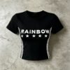

This cropped T-shirt is a focused development study in color consistency: a black base, white screen print, and narrow side stripes must remain visually balanced under changing light. VeeWen can translate the image evidence into an approval sequence covering fabric, ink, trims, and placement.
Why Lighting Controls This Graphic
White ink against black fabric creates a strong visual threshold: small shifts in brightness, undertone, or surface reflection can change the perceived relationship between artwork and body. The graffiti setting in the image makes that contrast especially easy to observe.
The approval target should therefore be defined under consistent lighting rather than casual daylight alone. Review the black base, white print density, and stripe brightness together, because a correct individual color can still look mismatched when viewed as a complete garment.
Graphic Placement Is Part of Color Approval
The chest artwork sits centrally across the upper torso, while white stripes travel down both sides. Their repeated vertical rhythm makes placement errors visible, and inconsistent print opacity could make one element visually dominate the other during production.
Confirm artwork dimensions against the selected graded pattern before sampling. The crop length changes the available print area, so the same graphic cannot be approved independently from body width, sleeve opening, side stripe position, and the visible gap above the waistband.
Fabric Surface Changes Perceived White
A cotton-blend jersey is named in the source reference, but its exact construction remains unverified. Surface hairiness, knitting tightness, and dye depth can influence how sharply white ink appears, particularly across a dark body with a compact graphic.
VeeWen's development review should record the fabric reference beside the print strike-off, not after it. If the final jersey changes, repeat the color check, because absorbency and texture may alter brightness even when the ink formula remains unchanged.
Trade-Offs in High-Contrast Production
A brighter white print improves immediate readability, yet heavier coverage may alter hand feel, flexibility, or wash appearance. A softer print can feel more comfortable but may reduce the crisp separation that makes the visible stars and lettering effective.
The buyer should set priorities before approval: maximum graphic brightness, softer touch, or a balanced middle point. That decision gives the sampling team a practical target and prevents subjective color comments from changing direction between review rounds.
VeeWen Workflow for Color Sign-Off
VeeWen can begin with the supplied image as a visual reference, then separate the approval into body-dye, artwork, and stripe checkpoints. Each checkpoint should be reviewed under one agreed lighting condition and recorded against the same physical sample.
After the buyer selects the fabric reference and confirms artwork scale, VeeWen can prepare a pre-production sample for integrated review. The release decision should cover black shade, white density, side alignment, crop length, and the final approved visual standard.
Buyer Approval Checkpoint
Before placing the style into production, inspect the complete sample under the agreed lighting setup and from normal viewing distance. Check whether the chest print, stars, and side stripes share the intended white appearance without competing for attention.
Approve only when the color standard remains convincing across the whole garment, not merely on a print swatch. Record acceptable visual tolerance, artwork placement, and fabric reference so subsequent cutting and printing decisions remain anchored to one buyer-approved sample.
Buyer Questions
Can the graphic be adapted for another cropped proportion?
Yes, artwork scale and placement can be reworked against a new graded pattern, but the buyer should repeat integrated lighting approval afterward.
Is the cotton blend composition confirmed?
No. The source wording identifies a cotton blend, but exact fiber percentages, fabric weight, and construction should be confirmed during development.
What should the color standard include?
It should identify the black body, white print, side stripes, lighting condition, approved sample, and acceptable visual tolerance for production review.
What is the commercial minimum?
The commercial minimum is MOQ: 100 pieces per style, subject to the final approved specification and development scope.
Approve the Visual Standard
Send your target artwork, color references, size range, and delivery requirements to VeeWen. We will organize the color-control checkpoints needed to approve this cropped graphic style confidently.



Reviews
There are no reviews yet.