
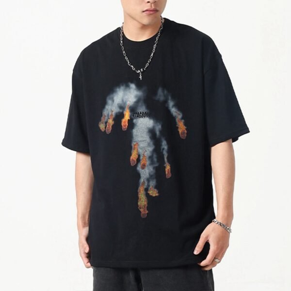
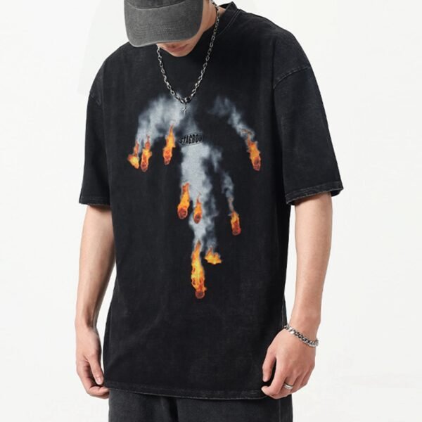
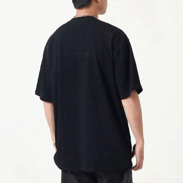
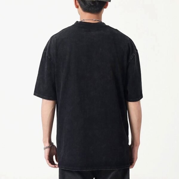


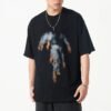
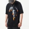

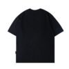
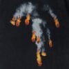

This custom oversized graphic T-shirt is developed around print placement across a size range. Its tall smoke-and-flame artwork occupies much of the front body, so scaling the garment without scaling the placement logic can weaken balance, chest clearance, and the intended vertical visual movement.
The Graphic Establishes The Garment's Center
The front artwork is the dominant product signal, extending from the upper chest toward the lower torso. Because the smoke and flame elements form a vertical composition, the print must be judged against the body's usable front panel rather than placed from a single neckline measurement.
A placement that looks centered on one sample can shift perceptually when chest width, shoulder drop, and body length change. VeeWen should define the graphic's horizontal center, top clearance, and lower stopping zone before grading, preserving the artwork's visual authority.
Oversized Proportions Alter Optical Balance
An oversized silhouette increases the available canvas, but it also changes how the wearer reads the graphic. Wider shoulders and broader chest volume can make a fixed print look undersized, while excessive enlargement may push flame elements into the hem or reduce breathing room around the neck.
The development target is proportional presence, not automatic enlargement. VeeWen can compare the artwork on multiple graded fronts using chest and length reference lines, checking whether smoke remains centered and the flame accents retain deliberate spacing at each size.
Top And Bottom Anchors Need Rules
The image shows smoke beginning below the neckline and flame elements descending toward the lower torso. Those two zones should become explicit placement anchors, because neckline depth and body length vary during grading and can change the perceived relationship between the graphic and garment edges.
A buyer approval sheet should record top clearance, centerline, maximum graphic width, and lower clearance for each size group. This creates a repeatable production instruction and helps prevent a print from drifting toward the collar or becoming crowded near the hem.
Print Density Meets A Dark Ground
The black body gives the grey smoke and warm flame-colored details strong contrast. That contrast makes registration, edge definition, and ink coverage visible, especially where several small flame shapes sit within the larger smoke form and where the graphic transitions between light and dark tones.
VeeWen's sample review should connect placement with artwork legibility. If the image is enlarged unevenly, small accents may separate too far from the smoke or move toward seams, changing the composition even when the print itself remains technically clean.
Neckline And Shoulder References Prevent Drift
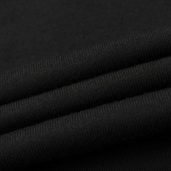
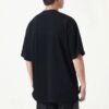
The ribbed crew neck and dropped shoulder define the upper frame of the graphic. On an oversized T-shirt, shoulder width can expand faster than neckline dimensions, making a print appear off-center relative to the body even when its paper template remains geometrically centered.
The pattern team should therefore use both neckline and front-body center references during grading. A fit sample can confirm that the graphic sits comfortably below the collar, avoids shoulder distortion, and remains visually stable when the shirt is worn untucked.
VeeWen Workflow And Approval Gate
VeeWen's product-development workflow should begin with a master artwork map tied to body measurements, then move through graded placement files and physical samples. The relevant approval is not only color or print quality; it is whether the composition survives changing proportions without losing its intended hierarchy.
Before production authorization, the buyer should review at least the requested size extremes and one central size. Confirm final cotton composition, 250gsm reference, print method, and measurement tolerances, then release the style at MOQ: 100 pieces per style.
Buyer Questions
Why does this graphic need size-specific placement?
Its tall composition spans the torso, so fixed placement coordinates can change chest clearance, lower spacing, and visual centering as body width and length increase.
Should the artwork scale identically with the garment?
Not necessarily. Placement and artwork size should be reviewed together, preserving the graphic's hierarchy while avoiding excessive width, hem crowding, or reduced neck clearance.
What source specifications still require confirmation?
The source references cotton and 250gsm, but final fiber composition, weight tolerance, print process, color standard, and grading measurements require buyer confirmation.
What is the minimum order quantity?
VeeWen's exact commercial minimum for this development record is MOQ: 100 pieces per style, subject to approved artwork, specifications, and production documentation.
Map The Graphic Before Grading
Share your artwork file, size range, measurement chart, and preferred print direction so VeeWen can build a scalable placement review for MOQ: 100 pieces per style.



Reviews
There are no reviews yet.