

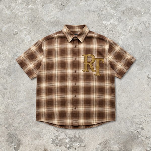
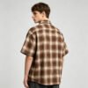



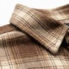
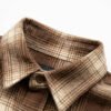
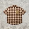
This shirt should be developed as a color-management project, not simply a decorated plaid style. The tightly spaced check pattern creates several neighboring tones, while gold-tone rhinestones reflect surrounding light. VeeWen can therefore structure approvals around controlled illumination, documented swatches, and decoration contrast before bulk production.
Why Lighting Changes the Plaid Decision
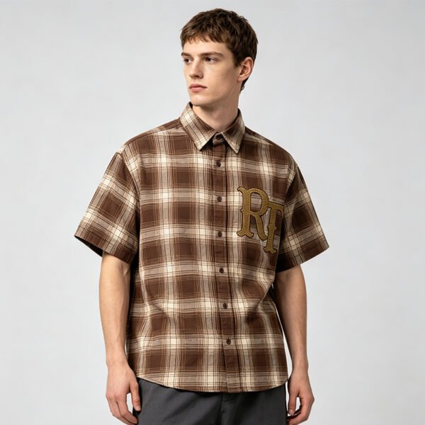
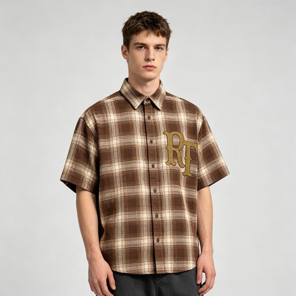
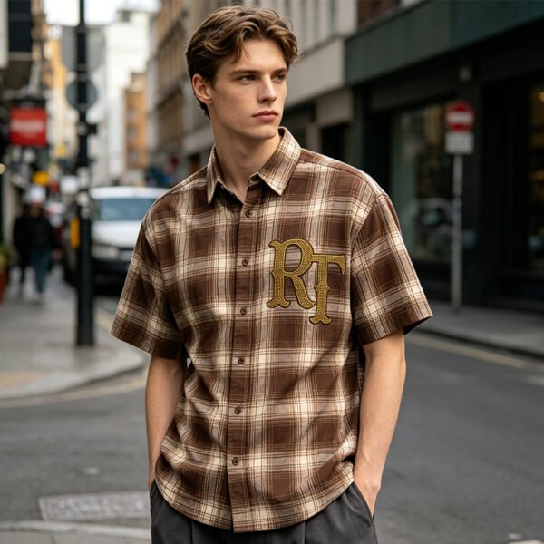
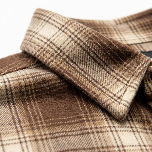
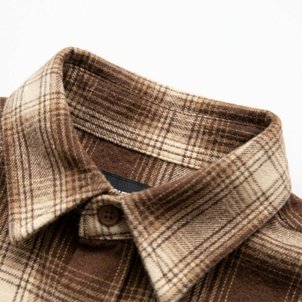
The image shows a warm plaid built from brown, beige, and cream lines rather than one flat color. Under warmer illumination, beige may read more golden; under cooler illumination, brown contrast can appear stronger, changing the perceived balance of the entire shirt.
Because the check scale is fine and repeated across the visible panel, small dye or yarn-tone deviations may distribute across many intersections. A buyer should judge the full front panel, not an isolated square, when approving the production color standard.
Rhinestone Reflection Raises the Contrast Risk
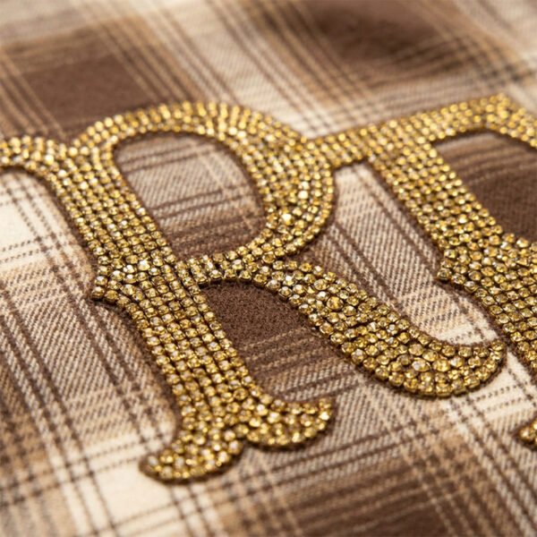
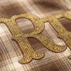
The chest lettering is formed from closely packed gold-tone rhinestones with bright specular highlights. Those highlights can make the decoration appear lighter, darker, or more saturated depending on the light source, so color approval must include the decorated shirt rather than fabric alone.
The physical mechanism is interaction between reflective stones and the plaid beneath them. If the ground becomes too warm or too dark, the lettering may lose separation; if it becomes too pale, the stones may dominate. Both outcomes affect commercial readability.
Build a Usable Color Standard
VeeWen's development workflow should establish a signed plaid swatch, a decorated placement sample, and a lighting record before grading or bulk cutting. The record should identify the lamp condition, viewing distance, and acceptable tone relationship between ground, lines, and stones.
This checkpoint is more useful than approving a digital image, because screens introduce their own brightness and color variables. The buyer should retain physical references for the base fabric and finished decoration, then compare production submissions against both under the same illumination.
Check Pattern Continuity at Garment Scale
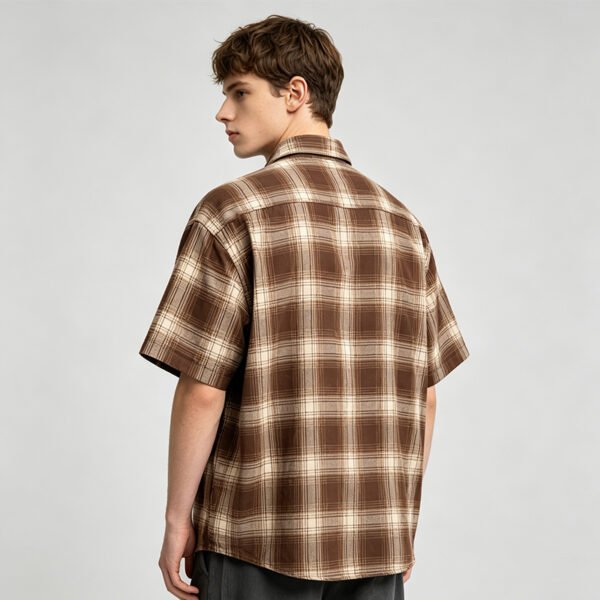
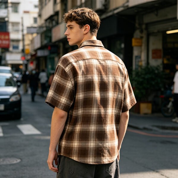
Color consistency also includes how plaid tones meet across front panels, sleeve joins, and pocket areas if pockets are added. A stable shade can still look inconsistent when pattern alignment interrupts the visual rhythm or places a dark line beside the lettering.
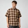
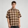
The oversized direction increases the amount of visible plaid, making repeat continuity commercially important. During sample review, inspect the complete front, both sleeves, and collar area together, then record whether alignment and color balance support the intended relaxed silhouette.
Balance Decoration and Wearability
Dense rhinestone lettering adds visual weight to a lightweight-looking plaid surface, so decoration placement should be reviewed with the relaxed fit and short sleeve opening. Excessive concentration near a seam or edge may alter drape and make the shirt feel visually front-heavy.
VeeWen's workflow should confirm artwork dimensions, stone density, and placement tolerance on the actual graded pattern. The buyer should approve the balance between readable lettering and flexible shirt movement before authorizing size expansion or final production documents.
Final Approval for Bulk Production
The final approval should combine three physical references: the plaid color standard, the decorated front sample, and the approved lighting condition. Together they create a practical decision framework for identifying shade drift before it becomes a cutting or finishing issue.
For this style, the buyer's release checkpoint is clear: approve only when the plaid remains balanced, rhinestones retain readable contrast, and the oversized proportions present consistently under the agreed light. Any unresolved color relationship should return to sampling before bulk commitment.
Buyer Questions
What should be approved first for this shirt?
Approve the physical plaid swatch and lighting condition first, then review a decorated sample so ground color and rhinestone reflection are judged together.
Can the plaid color be customized?
A custom color direction can be developed, but final feasibility depends on selected fabric, available yarn or dye references, decoration contrast, and signed physical approval.
How should the rhinestone color be reviewed?
Review stones on the actual plaid under consistent lighting, checking readability, reflectivity, density, and contrast rather than relying on isolated artwork or screen previews.
What is the minimum order quantity?
The commercial minimum is MOQ: 100 pieces per style. Final development requirements, grading, decoration details, and material selections should be confirmed before production planning.
Approve the Color-Controlled Development Route
Send your artwork, preferred plaid direction, target size range, and reference colors. VeeWen can organize the physical approval checkpoints needed before you release this style at MOQ: 100 pieces per style.


Reviews
There are no reviews yet.