
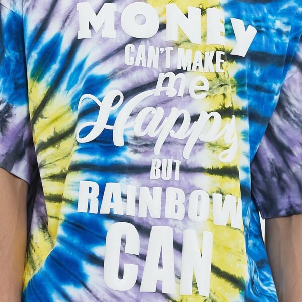
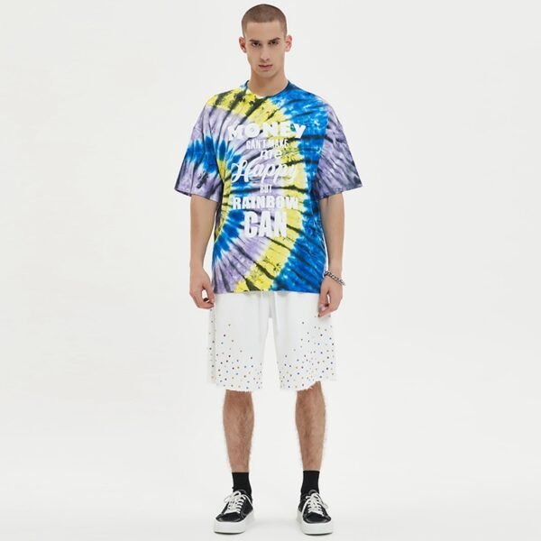

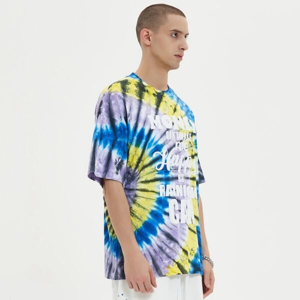
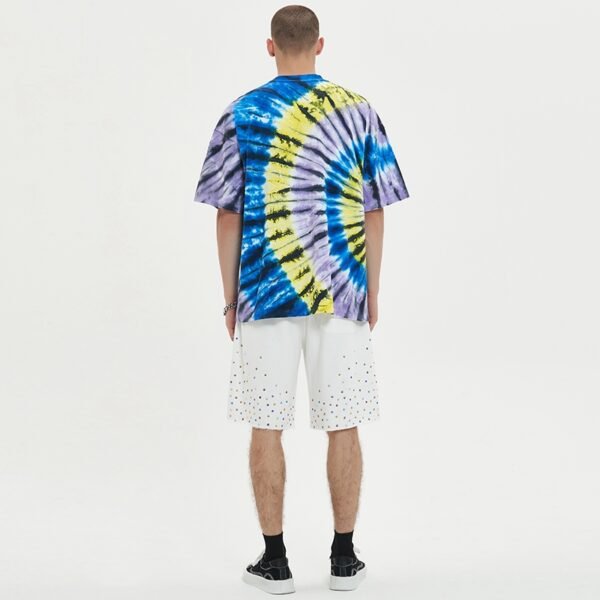
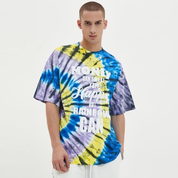
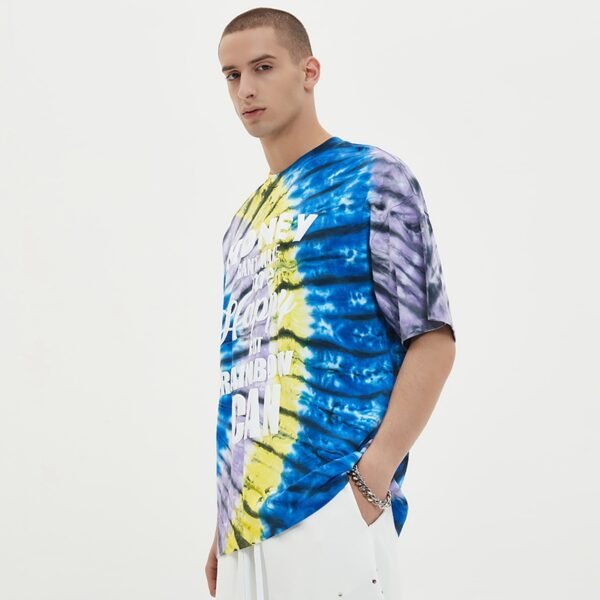
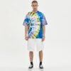

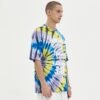
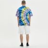
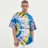
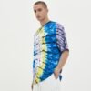
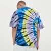
This T-shirt is built around decoration containment rather than a plain graphic placement. The supplied image shows raised white lettering distributed across a vivid blue, yellow, and lavender tie-dye field. VeeWen's development focus is keeping each printed zone legible, stable, and production-ready across color variation.
Why Patch Placement Matters on Tie-Dye
The supplied image places large white lettering over a strongly varied ground, with blue, yellow, and lavender areas crossing the front. Because the base changes beneath the graphic, each printed patch must be positioned for contrast rather than treated as decoration on a uniform blank.
If a lettering zone lands across a pale tie-dye burst, its edge may lose definition even when the print itself is correct. The placement map should therefore identify acceptable color windows, preserve spacing between graphic components, and account for front-body variation during cutting.
Containing Raised Print Across Zones
The graphic uses multiple visual treatments, including block capitals and flowing script, distributed from the upper chest toward the lower torso. Raised print adds physical height, so containment around each zone helps limit accidental overlaps, edge spread, and interference with adjoining lettering.
A production-ready artwork file should define the boundary, gap, and registration relationship for every component. The buyer should review whether the print remains comfortable at seam-adjacent areas, especially where the torso curves or where a large lower letter approaches the garment's finishing zones.
Tie-Dye Variation and Graphic Legibility
Tie-dye creates intentional irregularity, but that irregularity makes graphic approval more complex. The image shows a bright ground with strong tonal movement, so white raised lettering functions best when its scale, spacing, and location are planned around the color distribution instead of applied without visual zoning.
VeeWen should review a representative dyed panel or physical strike-off before finalizing the print map. Digital artwork alone cannot prove how the color breaks will align beneath each letter, and a small placement adjustment may protect readability more effectively than increasing print size.
Stitch Lines as Containment Boundaries
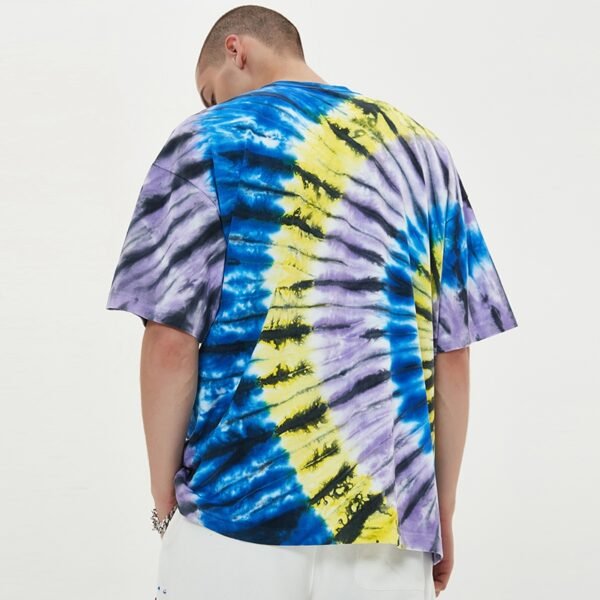
Stitch containment concerns more than decoration alone: shoulder seams, side seams, sleeve joins, and bottom finishing can influence how a printed panel is handled. The supplied image keeps the visible graphic primarily on the front body, which supports a controlled cut-and-sew sequence.
The pattern and artwork should be overlaid before sampling to confirm that critical letters avoid seam allowances and high-tension edges. This reduces the chance that sewing pressure distorts the raised print or that grading shifts a key word into an unstable construction area.
VeeWen Development Workflow for This Argument
VeeWen can translate the image into a layered development package containing the tie-dye color map, graphic zones, seam overlay, and raised-print boundaries. The first sample should test ground variation and print containment together, since either element can change the perceived balance of the finished front.
Once the buyer selects an approved color-flow range, VeeWen can lock placement rules for cutting and decoration review. The checkpoint is not simply whether the sample looks bold; it is whether the graphic remains contained and readable when the production sequence is repeated.
Trade-Offs Before Bulk Approval
Larger raised lettering improves visibility over a busy ground, but increases print area, hand feel, and the risk of crowding near construction points. Smaller lettering preserves breathing room, yet may disappear where tie-dye becomes light or where script details become intricate.
The buyer should approve a practical compromise using physical samples from representative color variation. Confirm print height, component spacing, seam clearance, wash expectations, and size placement before issuing the final specification for MOQ: 100 pieces per style.
Buyer Questions
Why is placement harder on this tie-dye shirt?
The ground changes color beneath the graphic, so placement must protect contrast and spacing instead of relying on one consistent background.
Is the 100 percent cotton claim verified?
The source wording references cotton, but the supplied evidence does not independently verify a percentage. Confirm fiber content, fabric weight, and finishing behavior before production.
How should puff-print zones be approved?
Review each component for edge containment, spacing, seam clearance, and legibility over representative tie-dye panels before approving the complete decoration map.
What is the required commercial minimum?
The commercial minimum for this development is MOQ: 100 pieces per style. Final quantities, color variations, and print details should follow the approved specification.
Approve the Graphic Containment Map
Send VeeWen your artwork and target color range for a coordinated review of tie-dye variation, raised-print boundaries, seam clearance, and graded placement before MOQ: 100 pieces per style.


Reviews
There are no reviews yet.