



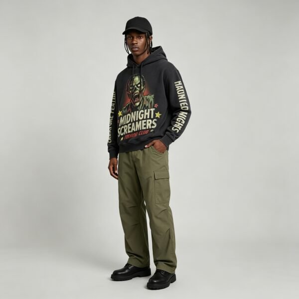





This hoodie development centers on wash recipe versus decoration timing. The supplied image shows a washed black pullover carrying a large multicolor zombie graphic, cream lettering, red subtext, and tonal wear that must age as one coordinated surface.
Process Order Controls the Finish
The wash recipe changes the sweatshirt surface before, during, or after decoration, and each sequence creates a different relationship between fading and graphic clarity. The image shows both aged black fabric and intentional artwork contrast, so timing is a product-defining decision.
Applying decoration after an aggressive wash may protect graphic definition but leave the print looking newer than the body. Decorating before washing can integrate the artwork into the vintage surface, yet risks color softening, edge change, and uneven exposure across panels.
Reading the Graphic Evidence
The supplied image shows a centered zombie illustration, luminous pale eyes, cream block lettering, red supporting text, and scattered colored stars. This palette needs enough contrast against black to remain legible after surface treatment, especially around small interior details and distressed tonal areas.
The artwork occupies a broad uninterrupted front panel, which simplifies placement but increases the importance of scale and vertical registration. Because no pocket interrupts the composition, the hood opening, shoulder balance, hem position, and side-to-side centering should anchor the approval.
Wash Intensity Versus Ink Clarity
A stronger wash can create a more convincing aged black ground and soften the garment hand, but it may reduce saturation in red, yellow, green, and cream areas. The buyer should specify the acceptable relationship between body fading and graphic readability before sampling.
A restrained wash may preserve color separation and fine illustration detail, yet the body can appear too uniform beside the distressed mood shown. The target should be a controlled tonal break where surface age is visible without making lettering or facial features difficult to read.
Decoration Timing by Graphic Zone
Different graphic zones may react differently because dense illustration, block lettering, and small accent marks do not carry the same visual tolerance. The zombie face and large words can accept measured softening, while thin edges and small stars need closer registration review.
The development sequence should examine the complete front after washing, not only an isolated print swatch. Compare eye brightness, cream lettering, red subtext, and colored accents across the finished panel, then record which changes are intentional and which require process adjustment.
Balancing Oversized Volume
An oversized silhouette gives the graphic room to read and supports the broad front composition visible in the reference. However, added body volume increases folds, which can interrupt lettering and create uneven shadows that make print quality appear inconsistent during wear.
Dropped shoulders and relaxed sleeves also distribute wash exposure across larger fabric areas than a compact fit. The buyer should review the graphic while the hoodie is hanging, worn, and lightly folded, ensuring the chosen decoration timing supports all three views.
VeeWen Development Checkpoint
VeeWen can apply this argument through a controlled sequence: confirm the graphic artwork and placement, compare wash-first and decoration-first options, then review finished-body samples under the selected oversized pattern.
The approval checkpoint is a direct comparison of body aging, ink clarity, color separation, and hand feel. Confirm the sequence before grading and bulk preparation, because artwork scale and wash exposure interact across every size and panel.
Buyer Questions
Should the hoodie be washed before printing?
Not automatically. Compare wash-first and decoration-first samples because the chosen sequence changes graphic sharpness, color retention, edge character, and relationship to the aged body.
Which graphic details need closest review?
Review the zombie facial features, pale eyes, cream lettering, red subtext, and small colored accents after washing because each has different tolerance for softening.
Can the washed black shade vary?
Yes, the wash target can be developed through controlled tonal references, but acceptable variation should be documented alongside graphic contrast and oversized fit approval.
What is the commercial minimum?
The commercial minimum is MOQ: 100 pieces per style, with final artwork, wash sequence, grading, and approval checkpoints confirmed during development.
Approve the Wash Sequence
Send your artwork, target black shade, fit measurements, and aging references. VeeWen will compare decoration timing on finished-body prototypes before the wash and graphic direction is approved.



Reviews
There are no reviews yet.